Most Awaited Apple Watch Released with Health Apps

The wearable Apple Watch is launched  with many amazing features like Health App, Calling Features, Messaging etc.

iwatch

Users can swipe over the screen to select an event or action on the Apple Watch It will be using Thumbnail technology to detect your photos on the smart watch. Lets have a glance over the features it will be providing to the users :

Most Awaited Apple Watch Released

Availability and Price :-
Availability of Apple Watch will be in the year 2015. Pricing for the Smart Watch has settled at $349 which means Rs 21,245.38 (Indian Rupees). more than that Apple has unleash six different strap to be wear as per your dressing style and personality.

Apple Watch Announced

Apple Watch Specification :-
Apple CEO Tim Cook have not said anything yesterday in the California Conference. People have to wait much more to get Apple Watch specification. But as it heard from the sources that Apple Watch will provide Health Apps to the user ans Yes it will. It will be providing feature to its users by giving him/her information about the burnt calories, time spent standing.

So these are the basic features yet disclosed. Stay connected with this article to get more information about the exact availability, price and specification technical for the Apple Watch.

21 Mesmerizing Exteriors

Though most of the posts here don’t focus on exteriors, there is no question that these homes warrant a second look. For these 21 homes, talented architects and designers have created spectacular exteriors with gather places, water features, and landscaping that makes these homes the height of luxury.

1 | Visualizer: MTaher

This first home features a massive, curving pool that looks lovely and inviting day or night.

1-lighted-pool

2 | Visualizer: Architype 3D

The foggy backdrop for this cantilevered house contrasts perfectly with its stone and wood frame. Hard and soft, sturdy and precarious, all captured in one image.

2-cantilevered-house

3 | Visualizer: Vladimir Homza

The beauty of exploring exteriors is that, from a distance, it is easier to imagine what your life might be like inside. This futuristic capsule home, for example, feels like the perfect space to fill with automated spinning beds, remote controlled curtains, and other Austin Powers-styled accoutrements.

3-amazing-modern-home

4 | Visualizer: MQA Design

Of course, there is always beauty in the simple, boxy style of modernism. From Huge windows to a narrow rectangular pool, this one’s all about the angles. 4-gorgeous-minimalist-home

5 | Visualizer: Matheus Passos

What better way to make sure everyone knows you have better taste than them than to elevate your entire house? This unique, stacked box design makes no mistake about who’s looking down on who.

5-modern-ranch-home

6 | Visualizer: W.Alam

Another cool, modern house with sweeping views but this one comes with two cozy outdoor sofas, perfect for lounging or, if you’re a celebrity, canoodling.

6-house-with-a-view

7 | Visualizer: Carlos Marenco

This cantilevered living room and deck would be just as comfortable in the Hollywood Hills as it is here in the cold, elk-infested wilderness.

7-modern-home-exterior

8 | Visualizer: Vic Nguyen

A slightly angled roof set this modern house apart from its boxy brethren.

8-beautiful-deck-design

9 | Visualizer: Andrezej Drawc

By surrounding the ground floor of this super creative house with glass, you put your whole life on display. But if you live in this house, chances are that’s just what you want.

9-glass-patio

10 | Visualizer: Wojtek Lubinski

It’s hard to say whether the sleek straight lines or the clear desert sky is the real winner here.

10-simple-modern-home

11 | Visualizer: Miysis

It would be difficult to drag yourself inside after an afternoon beside this gorgeous pool.

11-beautiful-garden-area

12 | Visualizer: Vic Nguyen

A creative cut out above this deck creates a spotlight of sun until the last second.

12-modern-deck-design

13 | Visualizer: Miysis

While you may not want to five into this lily pond, it does make for a relaxing view from the deck.

13-personal-lily-pond

14 | Visualizer: Architype 3D

This beautiful multi-unit building features a central atrium. No one that lives here is lacking for Vitamin D.

14-modern-apartment-design

15 | Visualizer: Arqui9

Cabin in the woods means a lot of things to a lot of people. This is less “hunting lodge” and more “luxury retreat.”

15-asian-inspired-home

16 | Visualizer: Vic Nguyen

Expansive decks. Massive windows. Incredible views. And it’s huge. What else is there to say.

16-modern-luxury-home

17 | Visualizer: Numa

Another woodsy retreat that lets you get really close to nature.

17-modern-woodsy-retreat

18 | Visualizer: Vic Nguyen

There’s a lot of beauty in the simplicity of this boxy design nestled in the trees.

18-modern-cabin-design

19 | Visualizer: Iceci3

This concrete home sits so close to the edge of its pond it looks almost as if it’s floating.

19-private-pond-design

20 | Visualizer: Jishin Raj

How many stories worth of windows does one home need? Clearly it’s at least 3.

20-two-leve-home-design

21 | Visualizer: 2G Studio

Finally, we have a two story house on a lake with windows that swing open to really give you a taste of nature.

21-modern-box-home

50 Two “2″ Bedroom Apartment/House Plans

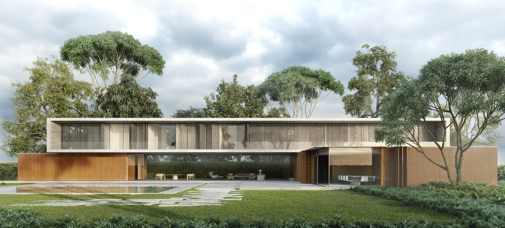
Two bedroom apartments are ideal for couples and small families alike. As one of the most common types of homes or apartments available, two bedroom spaces give just enough space for efficiency yet offer more comfort than a smaller one bedroom or studio. In this post, we’ll show some of our favorite two bedroom apartment and house plans all shown in beautiful 3D perspective.

1 | Visualizer: Rishabh Kushwaha

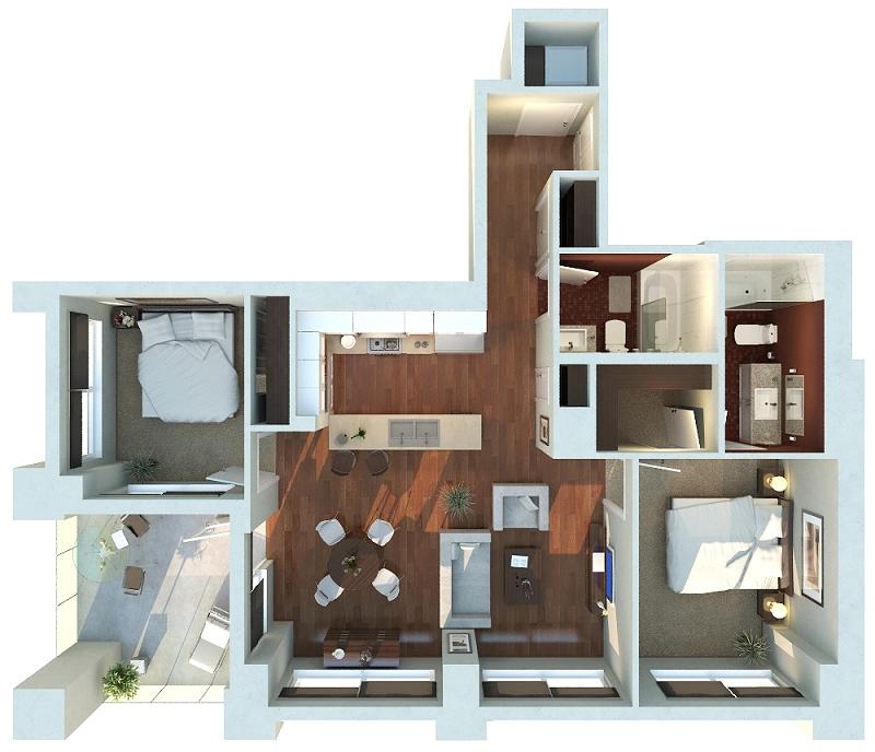
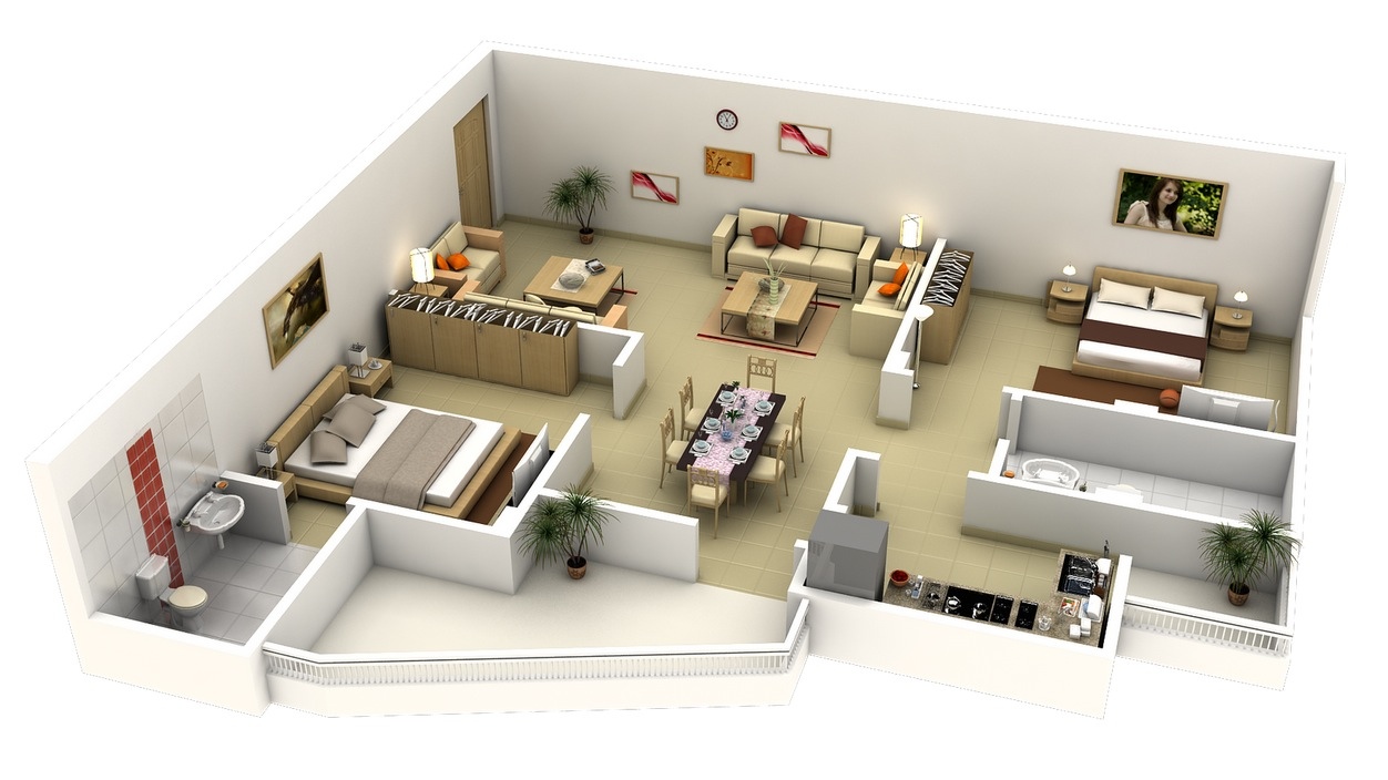
Similar to an L shape, but not quite, this apartment feels open and spacious with a layout that wraps each bedroom around a large shared living area.1-2-bedroom-house-plan

2 | Visualizer: Rishabh Kushwaha

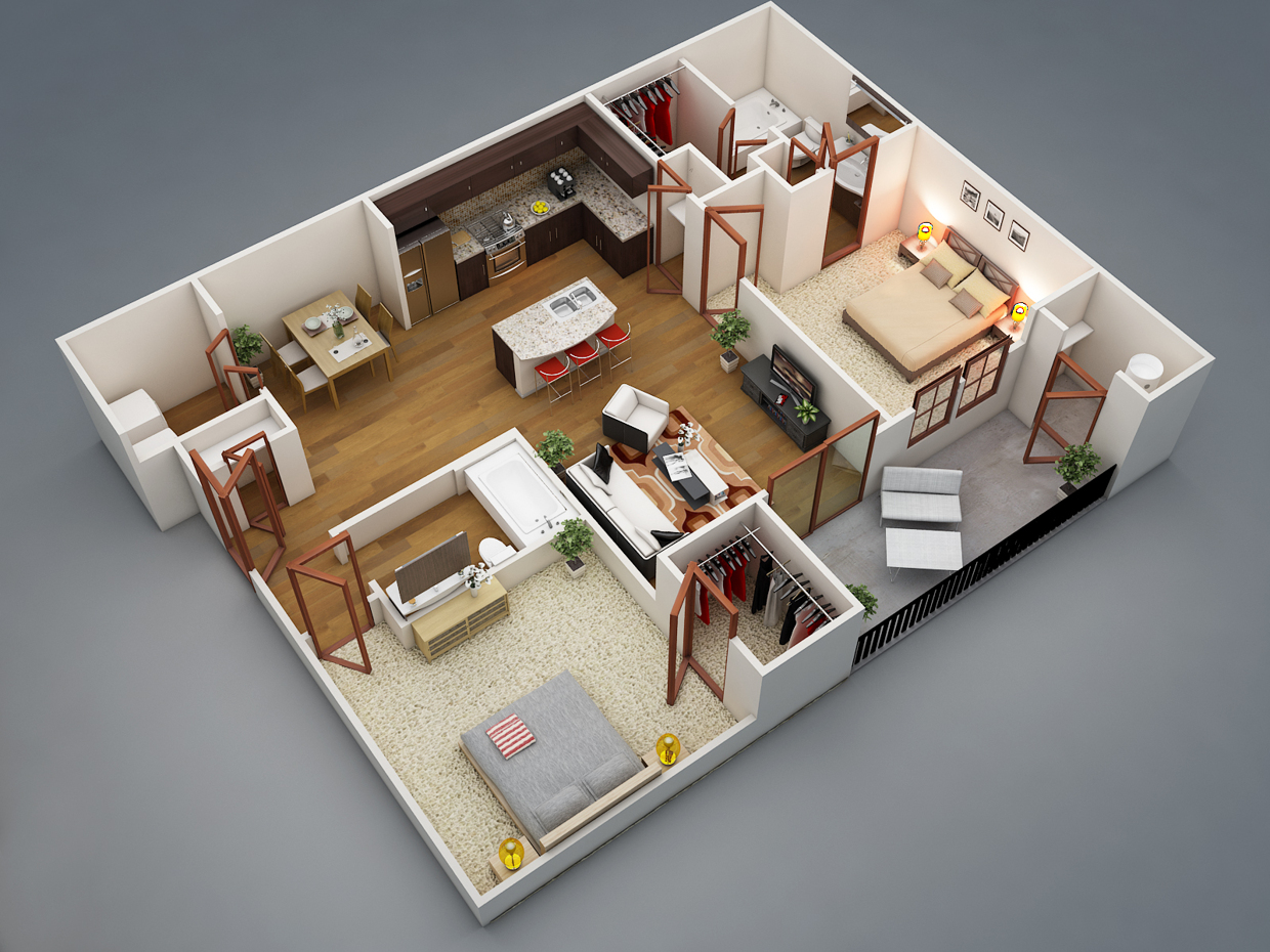
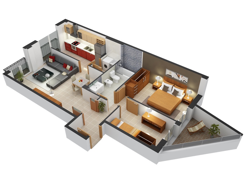
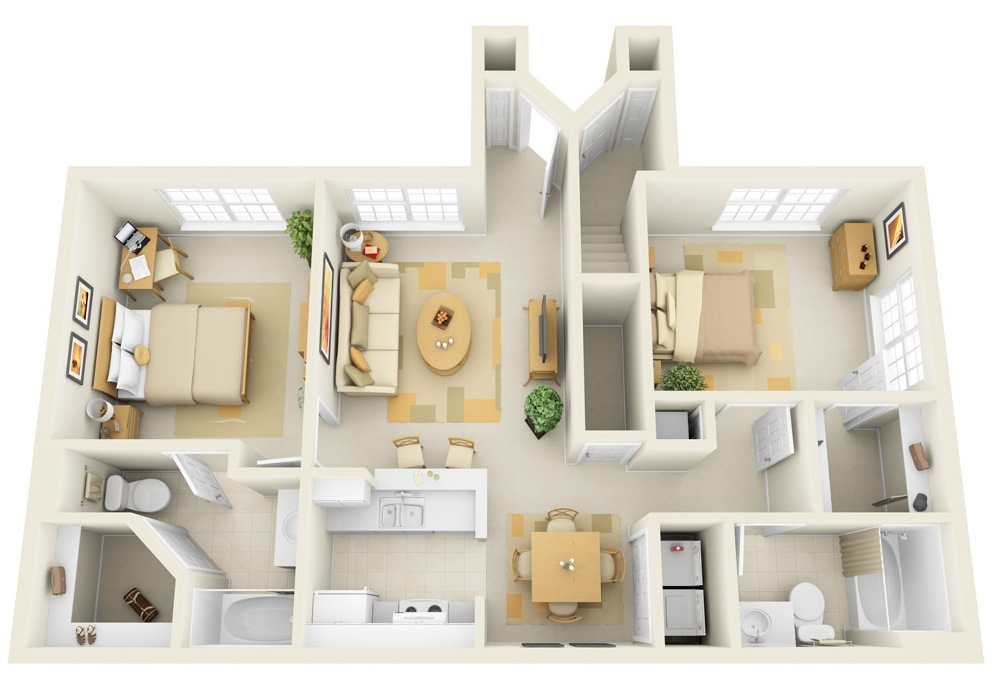
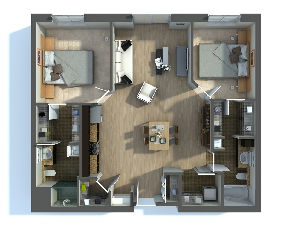
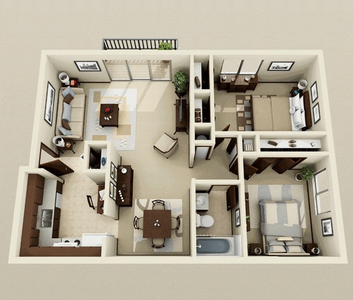
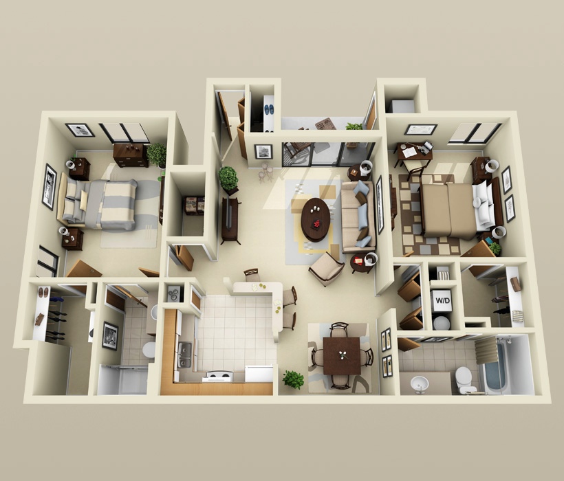
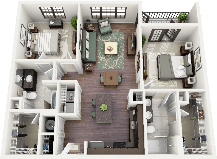
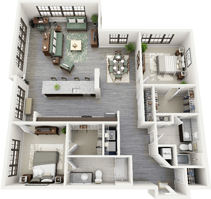
A two bedroom with a bit of privacy? Yes, it is indeed possible! The placement of the two bedrooms in this apartment plan ensures that you and your guests feel comfortable in your own spaces. Each bedroom offers ample closet space and adjoining bathrooms, with the shared common areas of the kitchen, dining area, laundry room, and living room in the center. 2-2-bedroom-bath-attached-house-plan

3 | Visualizer: Jermey Gamelin

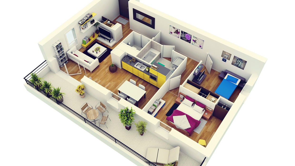
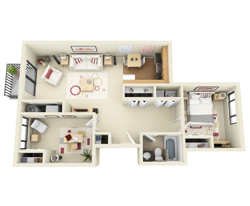
When you think of a modern apartment, we’d bet you’d visualize a lot of clean lines and natural light. This apartment plan captures just that with bright pops of color set against pristine whitewall and floors. Natural light shines through the space from a wall of windows and glass doors leading to a charming balcony. 3-Modern-Two-Bedroom-Apartment

4 | Visualizer: Jermey Gamelin

Bright pops of color make this two bedroom a cheerful space that anyone could fall in love with. Ample outdoor space with a full patio allows plenty of room for sun furniture and alfresco dining. 4-Modern-Two-Bedroom-Apartment-with-Balcony

5 | Visualizer: Jermey Gamelin

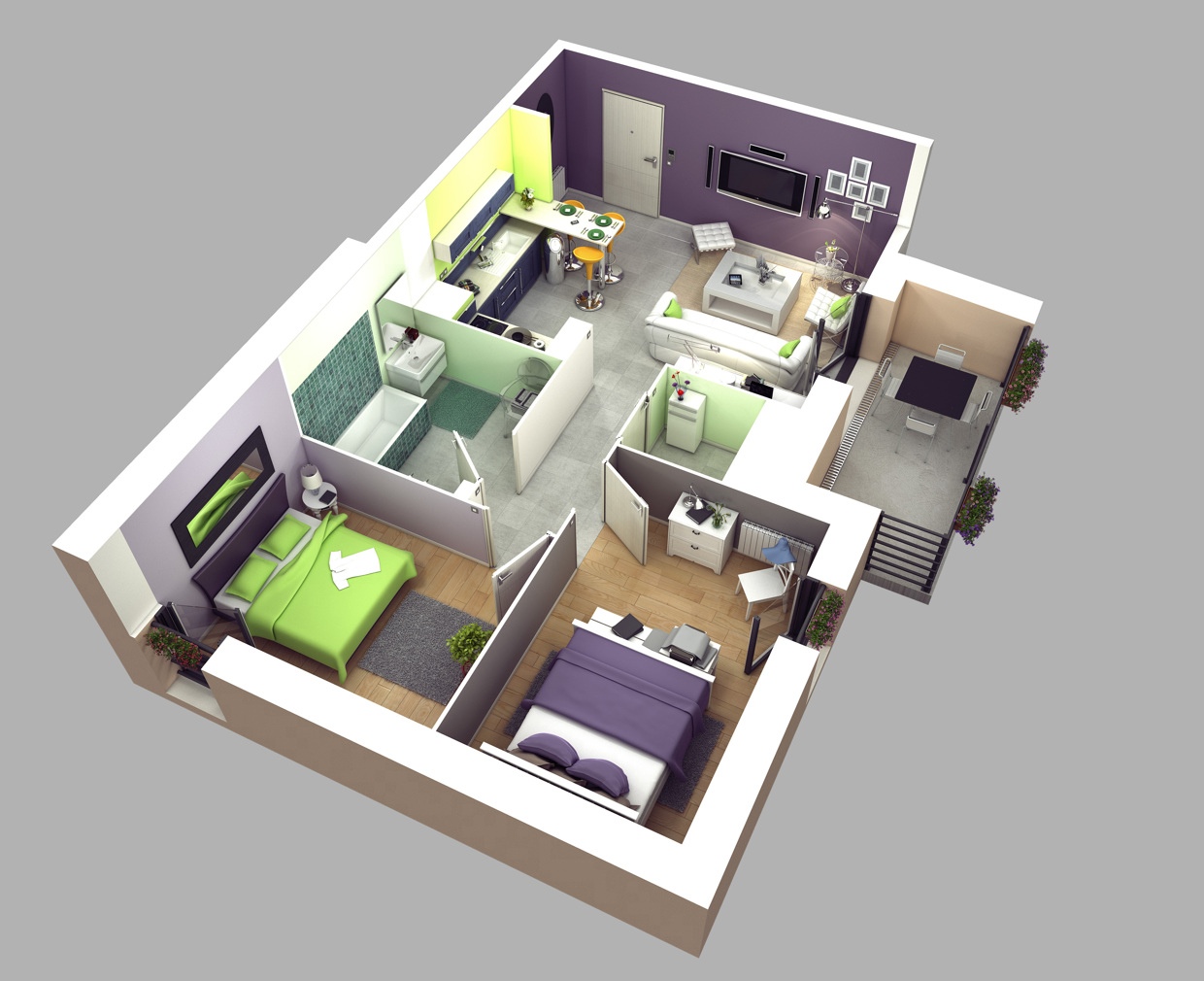
Soothing greens and purples in this design give this space a calm vibe, but it’s the efficient use of space that makes it a great fit for young couples in need of a guest room. 5-Two-bedroom-house-plan

6 | Visualizer: Jermey Gamelin

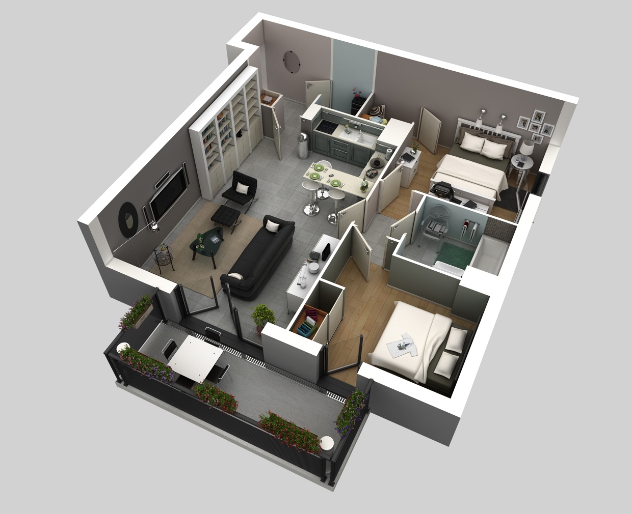
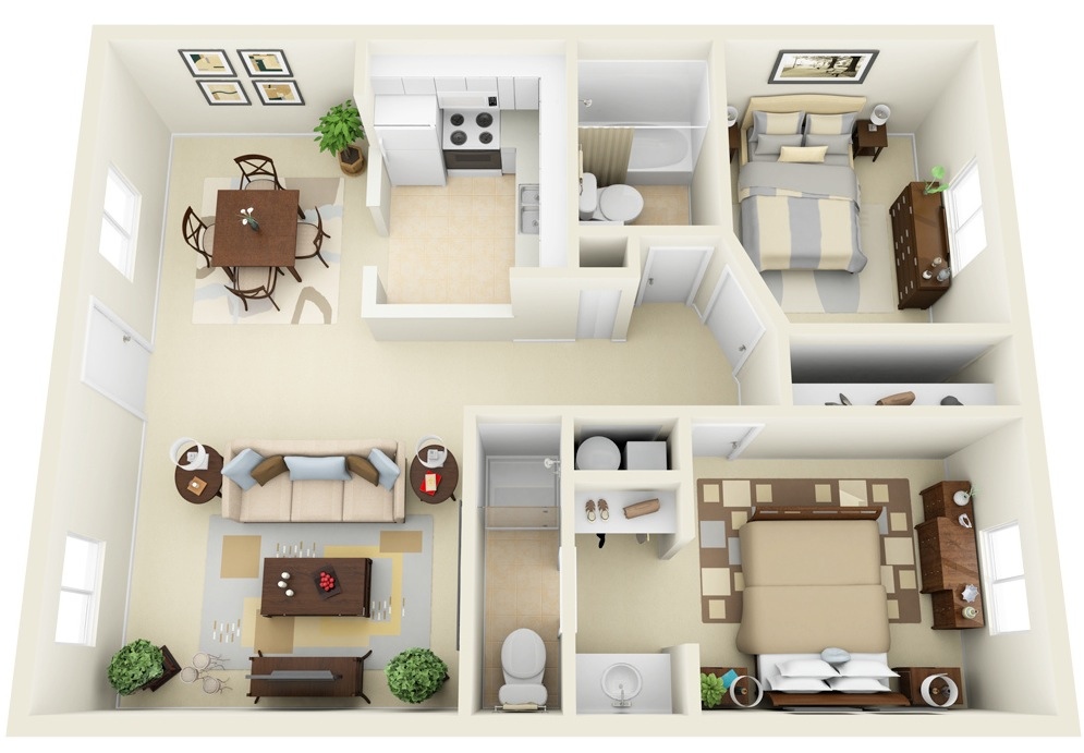
The sophisticated man will love the charcoal walls, hardwood floors, and modern kitchen of this two bedroom, one bathroom apartment visualization. 6-Masculine-Two-Bedroom-Interior

7 | Visualizer: Gurukrupa Group

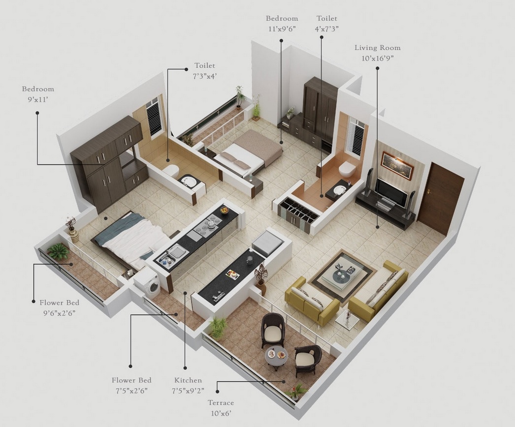
It’s the outdoor spaces that make this two bedroom plan a favorite. Two flower beds and a terrace give those with a green thumb a chance to indulge their love of gardening, no matter what floor they’re on! 7-Two-Bedroom-with-Patios

8 | Visualizer: Guillermina

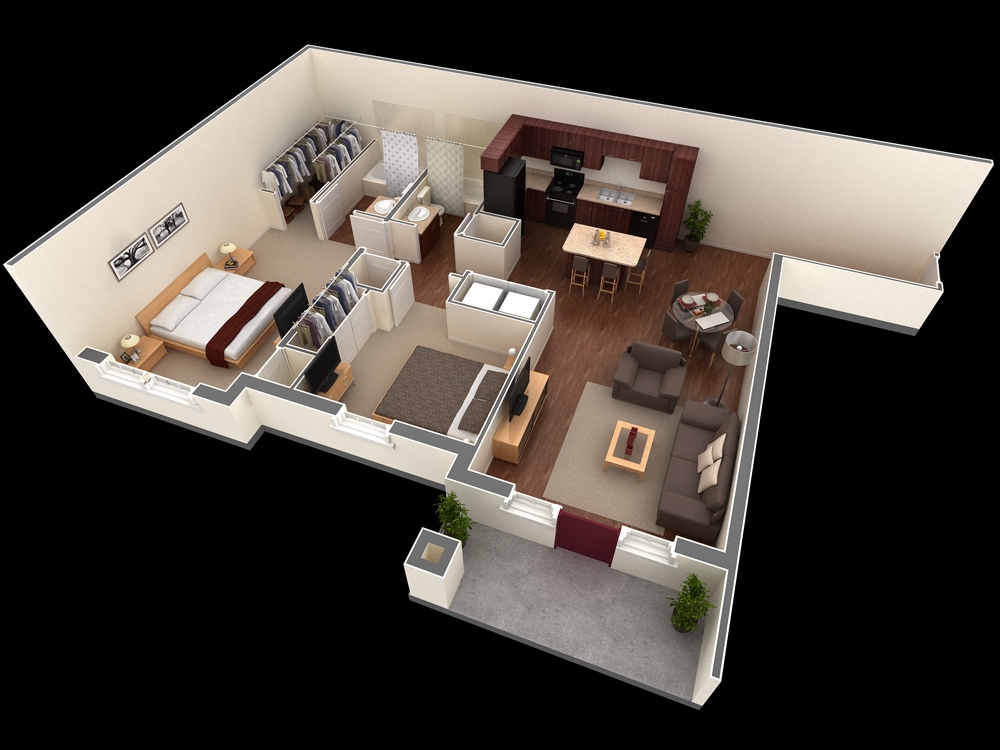
There are so many things to love about this visualization. First, the unique shape of the patio which lends both privacy and just enough space to enjoy a breath of fresh air. Then, the small (but comfortable!) footprint of the space itself, which showcases a living room with ample seating, modern kitchen, a bedroom large enough for king bed, a second sleeping area big enough for a twin, and a shared bathroom with luxury amenities. 8-Two-Bedroom-Apartment-with-Unique-Balcony

9 | Visualizer: HM Designs

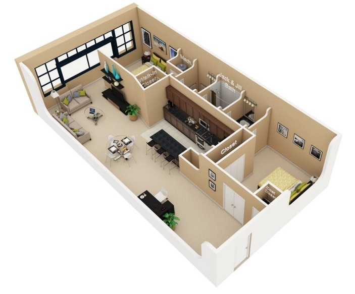
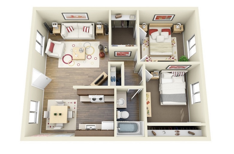
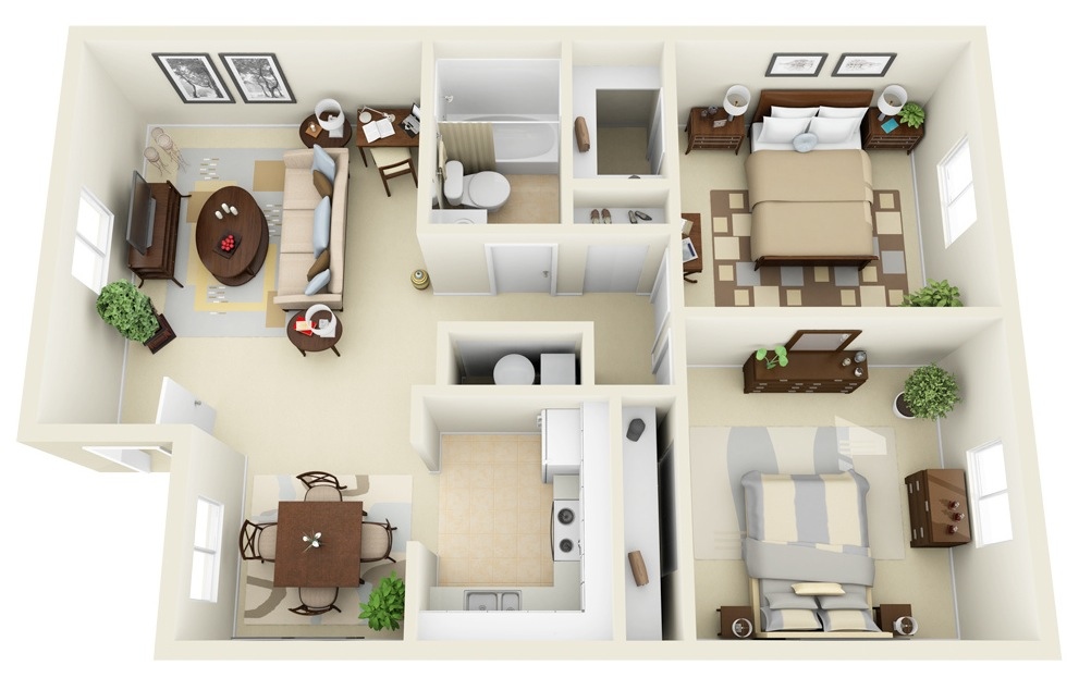
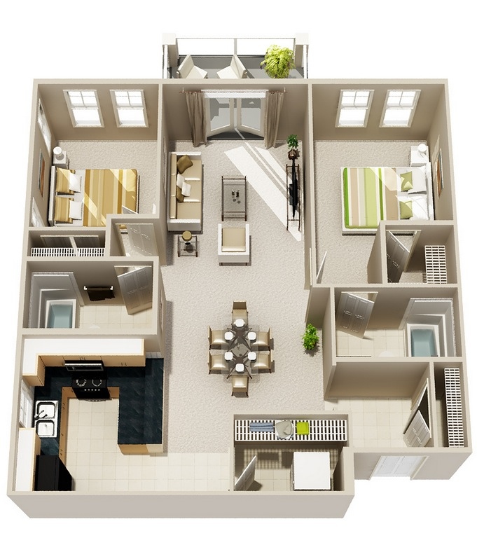
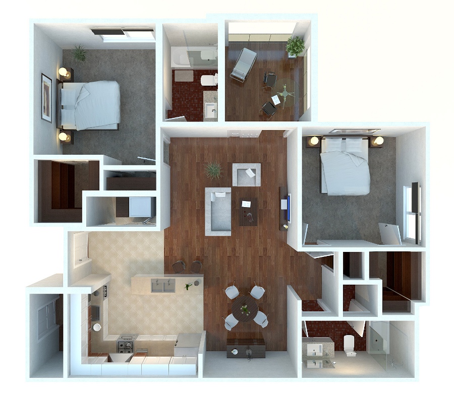
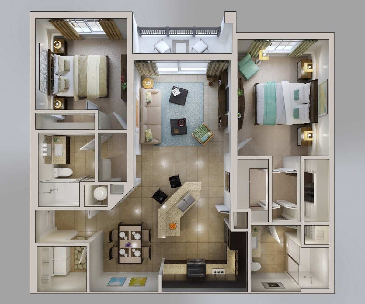
A Jack and Jill bath, plenty of closet space, and a spacious floor plan give this two bedroom apartment an open flow that’s comfortable for families, couples, or singles alike. Bedrooms are situated at opposite sides of the apartment, which can be ideal for guests or roommates while plenty of space in the common areas allows for easy dining, living, cooking, and entertaining. The kitchen is enviable with tons of cabinet space while the living area’s large windows throw ample light throughout the entire apartment. So much character! 9-Industrial-Loft-Style-Two-Bedroom

10 | Visualizer: Lorenzo Dixon

This two bedroom is all about living large with a smaller footprint. Although this space only offers two bedrooms and two bathrooms, it’s laid out to accommodate guests comfortably and offers unique design fixtures to give it charm. For example, custom tile work in the foyer, kitchen, and dining areas, a large whirlpool tool tub, and a living space that can be shared or kept private between the two bedrooms (and can accommodate a guest or two if you chose a fold out sofa).10-Large-Two-Bedroom-Apartment

11 | Source: Springs Apartments

When you think of the perfect apartment for young professionals or roommates, this plan may be exactly what you imagined. Rich hardwoods in the floor and cabinets, easily accessible private bathrooms, a nicely sized kitchen with island, and ample closet space make this apartment a paradise for those seeking a comfortable space for two. 11-Simple-Two-Bedroom-Apartment-PLan

12 | Source: Springs Apartments

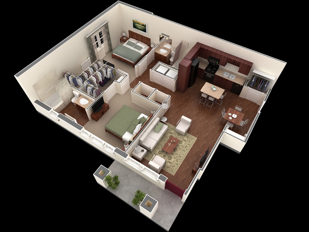
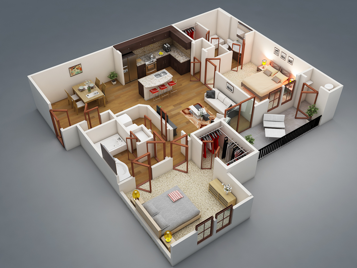
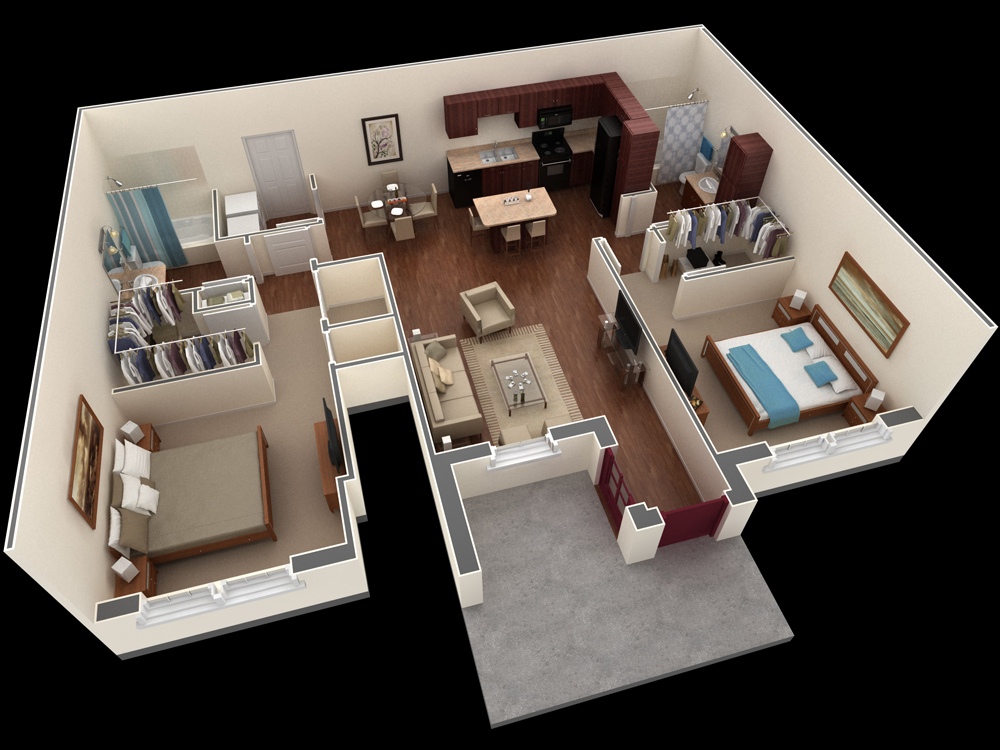
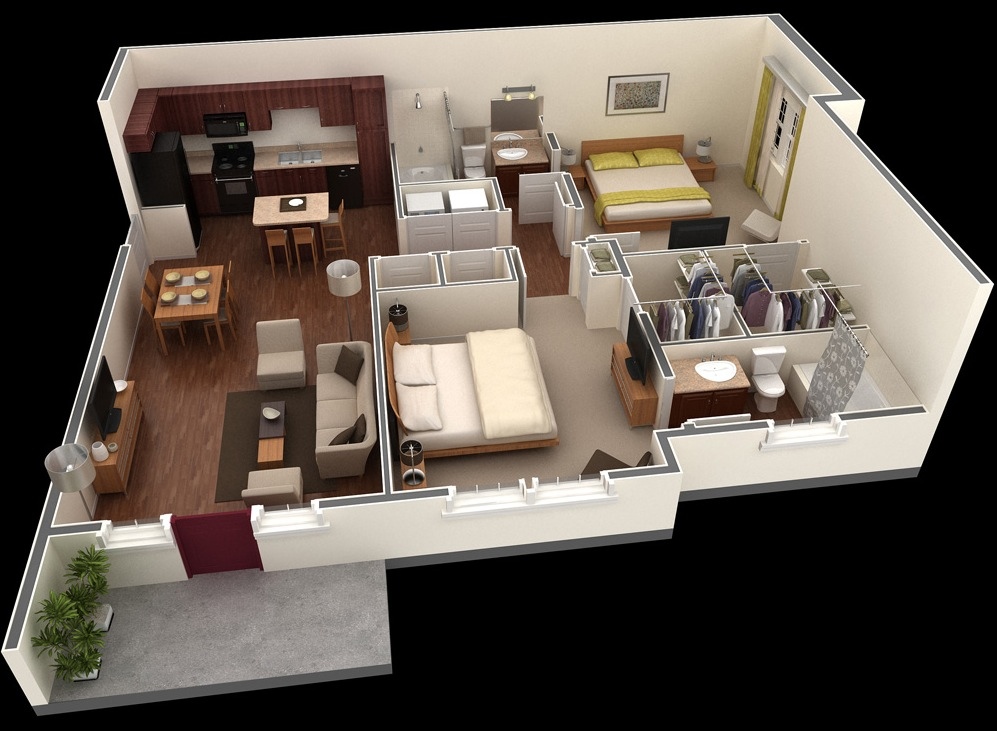
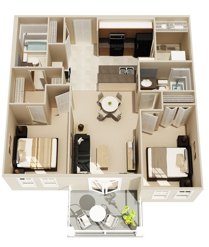
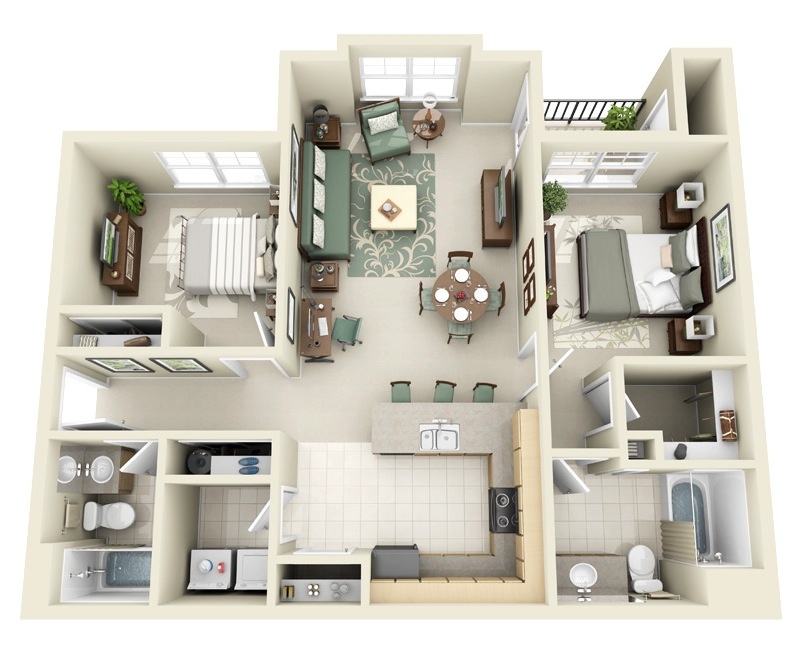
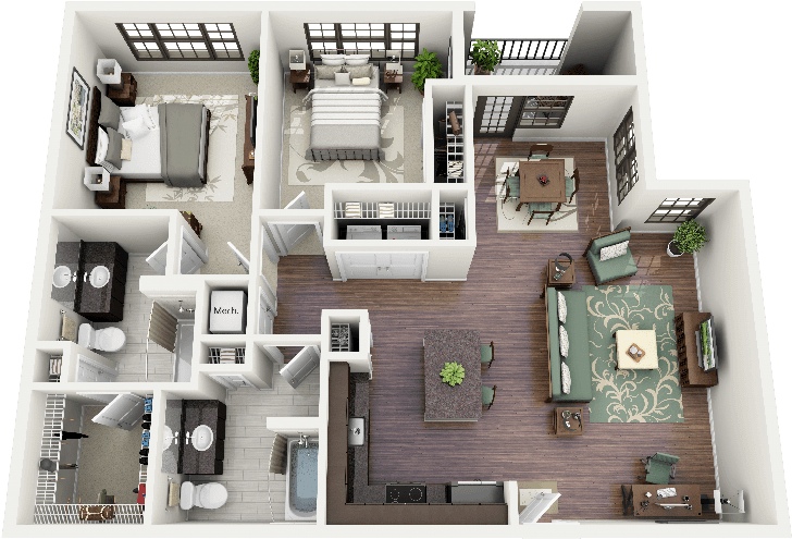
In another visualization from the same complex, you’ll see ideal living for two with even more privacy in this layout. Bedrooms are positioned at opposite ends of the apartment with common living areas shared in the center. 12-Shared-Apartment-Plan

13 | Source: Springs Apartments

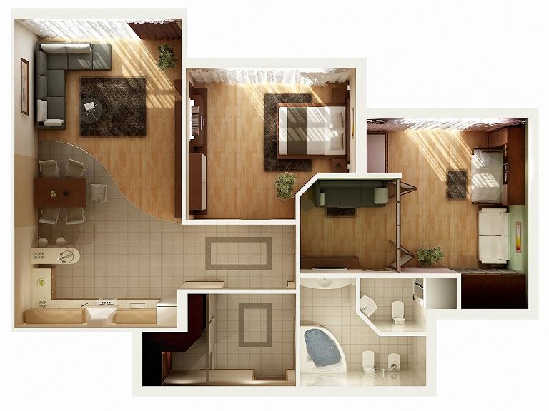
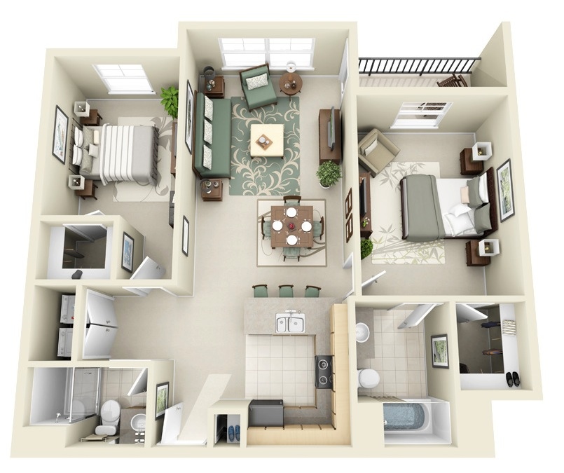
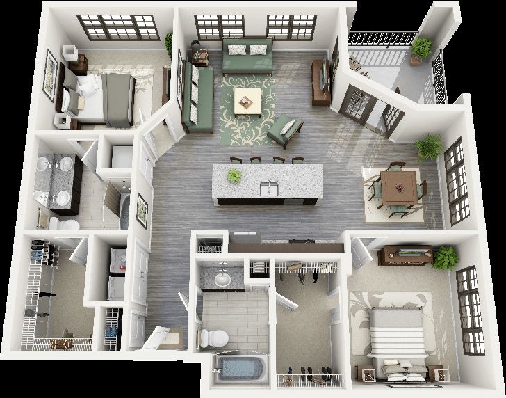
In a more compact version from the previous two in the same complex, this visualization is all about efficiency and making the most of a small space. Bedrooms and bathrooms are mirrored images of each other while the kitchen and living areas offer the right balance between utility and comfort. Rich hardwoods in the cabinets and floors remain throughout. 13-Springs-Apartment-Plan

14 | Source: Springs Apartments

In yet another layout from the same complex, you’ll find a two bedroom that’s perfect for small families. Room for a dinner table plus a kitchen island ensures there’s plenty of space for family dinners or entertaining. The bedrooms are spacious, especially the master bedroom which showcases a large closet and en-suite bathroom. 14-Springs-Apartment-Layout

15 | Source: Springs Apartments

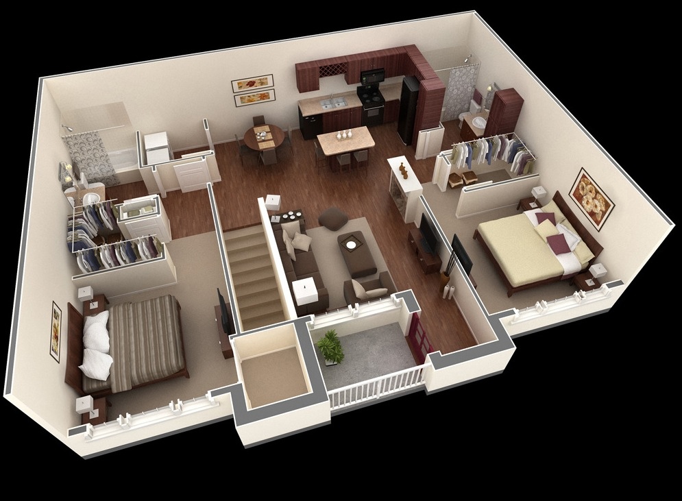
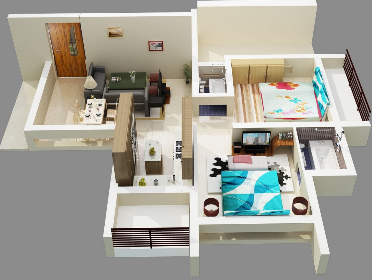
In this layout, you’ll see a second floor approach to two bedroom living. Walk up the stairs to a shared common area with a small but smart kitchen, a cozy living room, and a small terrace. The bedrooms on the other hand are quite large in comparison to the other spaces and each showcases a walk-in closet and easy access to their own bathrooms. 15-Springs-Apartment-Two-Bedroom-Plan

16 | Source: Rent Cafe

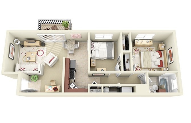
Bright and cheery, this two bedroom is all about incorporating lightness into a compact design. Although the rooms are small, they don’t sacrifice on style. There’s plenty of natural light in the living and dining areas, the kitchen is tiny but laid out well, and modern hardwoods give the apartment a luxe feel. 16-Bright-and-Cheerful-Two-Bedroom

17 | Source: Incore Residential

It’s the windows in this space and the walk-in closets that make it easy to fall in love. Two private entrances, closets bridging bathroom to bedroom, and just enough shared living space make this apartment a great fit for roommates seeking a bit of privacy without sacrificing amenities. 17-Incore-Residential-Two-Bedroom-Apartment-Plan

17 | Source: Summit Chase Apartments

In this visualization, you’ll see that a spacious two bedroom can be turned into a paradise for the single or a couple looking for a balance between work and living space. The master bedroom here is turned into a large office yet remains just private enough to not disturb the rest of the apartment, which has ample closet space even in such an efficient design. 18-Light-and-Bright-Two-Bedroom

19 | Source: Incore Residential

We love the modern look and feel of this apartment, which is laid out so that living and dining are shared yet the kitchen is just steps away from your table. Soothing colors throughout create a sense of calm. 19-Two-Bedroom-Floor-Plan

20 | Source: Incore Residential

We love the playfulness of this space, demonstrated by its cheery colors and modern shapes incorporated throughout. 20-Incore-Residential-Two-Bedroom-Floor-Plan

21 | Visualizer: Rayvat

This two bedroom apartment is all about drama, as shown by its bold design features, luxurious textures, and open floor plan. Natural light spills across the hardwoods and casts shadows over a large living area linking together two bedrooms, two bathrooms, and walk-in closets. 21-Dramatic-Lighting-in-Two-Bedroom-Apartment

22 | Visualizer: Hazil Al-Hakeem

Looking for something light and bright? This two bedroom space keeps it clean and simple with dominant neutrals and smart usage of its space. 22-Simple-Two-Bedroom-Floor-Plan

23 | Visualizer: Hazil Al-Hakeem

Bright pops of color, large rooms, and plenty of storage make this apartment feel fit for a couple or small family easily! We love the bold stripes in the bedding, the simple but luxe design details (hello, granite countertops!) and the cheery patio just off of the living area. 23-Two-Bedroom-Two-Bath-Floor-Plan

24 | Via: Space Dart

This space is all about attention to detail. From the layered textures in the bedding to the sumptous leather of the furniture, this is an apartment that takes modern design to a whole new level. Smooth tile in various shades creates a versatile and crisp floor throughout while rich hardwoods give the master bedroom charm (and how about that gorgeous balcony?) 24-Modern-Design-Two-Bedroom-Two-Bathroom

25 | Via: Show Me The Rent

Simple and sleek, this two bedroom shows the power of contrast as light walls are highlighted by dark wood molding, doors, cabinets, and trim pieces. 25-Contemporary-Two-Bedroom

26 | Source: Domaine At Villebois

The sophisticate will love the look and feel of this contemporary two bedroom which features a large master with ensuite bathroom and walk-in closet, a second bedroom and easily accessible second bath, a large living area, and a charming balcony. 26-Sophisticated-Two-Bedroom-Apartment

27 | Source: Domaine At Villebois

Looking for the feel of a larger space but only need two bedrooms? This design would be happy to obliged with ample space for furniture and belongings alike. A generous master suite and large layout ensures comfort for singles and couples. 27-Spacious-Two-Bedroom

28 | Source: Domaine At Villebois

With seating for four, a kitchen island for three, two bedrooms, two bathrooms, and plenty of closet space, this apartment begs to have guests over. 28-Large-Two-Bedroom-House-Plan

29 | Visualizer: Lorenzo Dixon

For an apartment that sticks just to the basics but doesn’t sacrifice high style, you’ll love this plan. Rich hardwoods, sumptuous tile, and a partially enclosed patio makes this two bedroom easy to fall in love with. 29-Minimalist-Two-Bedroom-Apartment

30 | Visualizer: Lorenzo Dixon

Two bedrooms, a simple living area, and two bathrooms ensure this space offers practicality, but it’s the view that’s worth it all – just look at those big windows and it’s easy to see why this is a must. 30-Two-Bedroom-With-Large-Windows

31 | Visualizer: Guillermina

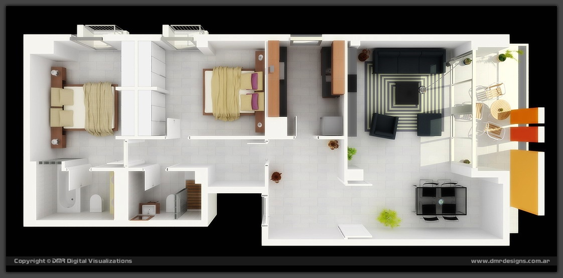
This modern two bedroom walk up showcases a futuristic balcony (just look at the metal work along the exterior), and is designed for roommates, complete with two bathrooms, two kitchens, and two separate living areas. 31-Modern-Two-Bedroom-Walkup

32 | Via: House Planology

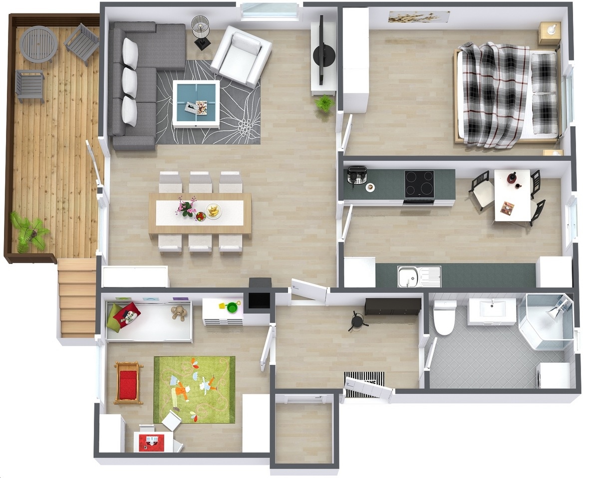
Ideal for a small family, this simple two bedroom house plan can incorporate just enough space for the essentials while giving you and your child enough room to grow. Enjoy summers out on the deck, dinner parties in the dining area, and plenty of backyard space for play. 32-Simple-Two-Bedroom-House-Plan

33 | Visualizer: Diego Reales

In one streamlined design, this two bedroom runs from east to west in a seamless space that’s anchored by a patio with bold exterior columns. 33-Argentina-Two-Bedroom

34 | Visualizer: Ahmet Nazif SATI

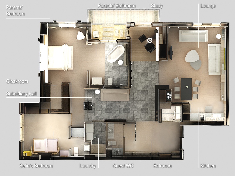
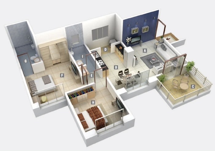
This plan showcases a kitchen, laundry, guest bathroom, two bedrooms, a subsidiary hall, study, lounge, kitchen, and cloakroom with striking stone details. Very zen-like. 34-Zen-Two-Bedroom-Apartment

35 | Source: Summit Chase Apartments

This two bedroom floor plan is simple, streamlined and convenient, as it offers easy access to a shared garage and entryway. 35-Summit-Chase-Apartment-Two-Bedroom-Floor-Plan

36 | Source: Paragon Apartments

For those that like a bit of privacy, this two bedroom showcases bedrooms that are separated by a common living area, ensuite bathrooms, and large walk-in closets. 36-Paragon-Apartment-Two-Bedroom-Plan

37 | Source: Kumar Properties

A bright blue wall gives this modern apartment a touch of playfulness. As a space, it’s very open and sleek with smooth tile throughout, tons of large windows, and a cute patio. 37-Two-Bedroom-with-Accent-Wall

38 | Source: Bridges At Kendall Place

Measuring in at 1,126 square feet, this rich two bedroom apartment offers its own laundry room, ensuite bathrooms, a master bedroom with dual closets (including built-ins), a charming patio, large kitchen with island and breakfast bar, dining area, and foyer space. 38-Bridges-at-Kendall-Place-Floor-Plan

39 | Visualizer: Tech N Gen

This two bedroom keeps things simple with a small but functional kitchen, two outdoors paces, and en-suite bathrooms. The blue tile in each adds a dash of color to an otherwise neutral palette. 39-2-bedroom-apartment-plan

40 | Visualizer: Tech N Gen

40-Large-2-Bedroom-Apartment-Plan

41 | Visualizer: Tech N Gen

41-L-Shaped-2-bedroom-apartment

42 | Source: Crescent Ninth Street

Sophisticated styling, rich hardwoods, modern appliances, and granite countertops are just a few of the highlights you’ll find in this gem. En-suite bathrooms AND walk-in closets? Yep. This space has it all. 42-Crescent-Ninth-Street-Floor-PLan

43 | Source: Crescent Ninth Street

Just when you thought a two bedroom couldn’t be better, this plan shows that it’s really the details that make it all matter. From granite countertops, ample kitchen space, large closets and a charming balcony, to the a cozy island, this space is made with a wow factor in mind. 43-Crescent-Ninth-Street-Apartment-Plan

44 | Source: Crescent Ninth Street

Welcome home. This positively decadent two bedroom offers plenty of square footage, luxury amenities, and a polished interior design. 44-Crescent-Ninth-Street-Two-Bedroom-Apartment

45 | Source: Crescent Ninth Street

This two bedroom luxury suite is more than just an apartment: it’s an urban oasis. Plenty of space for an ample wardrobe, a work area, a huge kitchen and dining area, two bedrooms, two bathrooms, and breathtakingly large windows for incredible natural light. 45-Crescent-Ninth-Street-Luxury-Apartment

46 |

46-2-bedroom-house-plans

47 | Source: Macquarieuv University

As a twist on traditional university housing, this two bedroom offers shared common areas, modern furnishings, and just enough storage space for you and your roommate. 47-Two-Bedroom-University-Apartment-Plan

48 | Visualizer: Max Jordan

Architecturally speaking, this is a very interesting space that brings together bold colors and shapes into something that’s modern and completely captivating. 48-Bold-Two-Bedroom-Apartment-Design

49 | Source: Indy Campus Apartments

College housing doesn’t have to be stark. In this plan, you’ll find all the comforts of home in a simple yet cozy atmosphere. 49-Indy-Campus-Apartment-Plan50 | Source: Bay Oaks

In Bay Oaks, enjoy mirrored bathrooms and bedrooms, along with a compact but uber functional living area in this contemporary apartment design. 50-two-bedroom-apartment-plans

Shah Rukh Khan buys Mughal-e-Azam posters for Rs 6.84 lakh

Superstar Shah Rukh Khan led bidders at the Osian’s auction of rare and vintage film memorabilia as he bought two majestic original posters of “Mughal-e-Azam” for Rs.6.84 lakh.

Last night’s sale, part of the auction house’s “Greatest Indian Show on Earth” series, saw 163 of the 220 lots being sold for Rs.55.60 lakh.

A painting by Arpana Caur ‘Pyaar hua, Iqraar hua’ showcasing the famous under the umbrella scene of Raj Kapoor and Nargis from “Shree 420? fetched the highest price of Rs.7.5 lakh followed by an original hand-painted hard board standee of “Yahudi” with Dilip Kumar and Meena Kumari in their famous embrace which went for Rs.4.8 lakh.

The auction’s most popular section focusing on the trio Raj Kapoor, Dilip Kumar and Dev Anand and leading heroines Madhubala, Nargis and Meena Kumari, generated the greatest interest and frenzied bidding, the organisers said.

Shah Rukh Khan

                                                                        Shah Rukh Khan

The “Gunga Jumna” artwork, signed and inscribed by Dilip Kumar in 1962, was purchased by the M Morarka Foundation, led by Kamal Morarka for Rs.2.16 lakh.

A six-sheeter poster of “Mother India”, which requires preservation work by the new collector, also witnessed hectic bidding, finally selling for Rs.2.52 lakh.

The Rajesh Khanna lots of “Anand” & “Bawarchi” also witnessed competition while the poster of “Junglee”, one of the earliest designs by Studio Diwakar, sold for Rs.72000.

Most other lots received reasonable interest especially some from the N N Sippy family collection, such as the hand annotated scripts of “Ghar” and “Meri Jung” (Rs.48,000). The calendar art angle of Indian cinema also received its fair share of interest with Priya Paul of the Apeejay Group buying it.

“It is very good to see the film fraternity finally taking a much larger interest and responsibility in helping to preserve this fragile heritage,” said Neville Tuli, chairman of Osian’s Group.

The first few lots of rare artworks and photographic stills belonging to some of the earliest films made by Prabhat Film Company and Prakash Studios captured the imagination of three major collectors.

Photographic stills of films like “Amrit Manthan” (1934), “Amar Jyoti” (1936), “Aadmi” (1939), “Padosi” (1941), “Rajput Ramni” (1936), “Baiju Bawra” (1952) were some of the other attractions among bidders.

10 Points To Remember When Fighting With A Loved One!

Do you hesitate to apologize and make up after a fight? It is important to keep tying loose ends, reassure loved ones and live life like you do not have a second chance!

Here are some rules that I have laid down for myself when fighting with those I cherish…

1. Fight it right

I am incapable of allowing a fight to carry on for too long or go to sleep without making up, as they say! For, the idea is not to never fight (arguments, discussions, fights play an important part in carving out the intimate space we share in a relationship) but to fight in order to save and improve the relationship, not deal it a deathblow!

2. Understanding issues

I do not like glossing over a disagreement or fight with a mere apology. It is very important to understand and address the underlying issues. So you talk. That is how you help build depth and a solid foundation in a relationship.

3. Think before you speak

Even when totally mad, I try not to lash out and say stuff that sticks. I used to, and realized when all was settled and back to normal, the only thing that rankled were the unrelated things said in an attempt to drive the dagger deeper.

4. Don’t be an escapist

I never talk of breaking off, not even under the gravest provocation. It is not even an option I allow myself to think of. I firmly believe that life and love is given to us for managing and growing together, not breaking off and running away from at the first sign of trouble.

5. Hold your tongue

I do not lose sight of the fact that I am talking to someone I cherish, whom I wouldn’t want to hurt irretrievably. So I force myself to be responsible with my words.

6. Wait-a-while

It is advisable to sit quiet and buckle up as you wait out any turbulence! So I do adopt this wait-a-while technique. It pays to cool off before talking the talk and often you realize the irritability is coming from elsewhere!

7. Speak up!

I do not believe in long silences. Men do, I understand. The silence would drive me nuts, as I imagined it indicated rejection, anger, coldness or humiliation. Finally it sunk in that it did not indicate anything. It is just another person’s, particularly a guy’s way of dealing with the situation.

8. Don’t dig into the past

I do this often even though I realize it’s wrong (who’s perfect?) — Revisiting a fight and using a later time to drive home my viewpoint. So I am quite used to hearing an all-suffering, “There we go again!” It shouldn’t be done.

9. Don’t hesitate

I never hesitate to apologize or be the first to make up. I think it is a sign of maturity and generosity of spirit. It doesn’t matter if you think you were right; you still hurt someone you care for, and that’s what you apologize for.

10. Give space

It is important to understand that we are all wired differently and so need to give space to each other to react in our own unique ways. We cannot force a rapprochement, though we can cajole it certainly. And so long as we make sincere efforts, we will not be left with regrets to deal with as unnecessary baggage on our flights!

The Disappointing Design of Apple’s New Gadgets

watch-design-inline

Alex Washburn/WIRED

The leader in technology design just introduced three very good products that should have been great.

As ever, Apple’s software environment is innovative and clearly superior in cohesion and experience, but its industrial design is what we were all watching for this week at the launch of the iPhone 6, 6 Plus and Apple Watch. The centrality of Apple’s industrial design is Steve Jobs’ legacy; it is what dictates Apple’s brand dominance, its marketing storyline and its strong effect on every one of us.

And it is here where Apple went slightly wrong.

First, the iPhones

The two iPhones are more troubling than the Watch, as they deal with a known set of problems Apple has answered better before. These ‘6’ twins are large devices with much softer styling than the ‘5’ and ‘4’ predecessors. Consider the styling lineage of the iPhone family: first soft lines, then sharp, and now softer again… what is going on? What is the guiding principle?

Great brands seek to instill a sense of clear direction and progression in their design evolution. For example, good car companies use show-models to communicate purposeful orchestration of their evolving roster of products. With this flip-flop, Apple’s choices begin to look arbitrary.

Yet styling is the least of the issues with the large iPhones. A fundamental problem of usability affects people every moment they physically experience either object, namely, the conflict between a barely graspable object and the size of the human hand. Similarly, “pocketability” is already a known problem in devices of this size, especially for women. Now, Apple was exceptionally positioned to modify the UI to fit larger phones. The company was also singular in its ability to optimize the form-factor around the screen, minimizing access thickness, width or length. Yet none of that happened: the iPhone 6 twins are plain and seemingly technical, even tactical, in their design approach.

Is Apple leading from behind, or refusing to lead? Samsung or LG are trying hard to bend and morph screens to fit humans, and Sharp developed a truly zero-border screen with the Aquos Crystal… why won’t Apple?

THE IPHONE 6 AND 6 PLUS DEAL WITH A KNOWN SET OF PROBLEMS APPLE HAS ANSWERED BETTER BEFORE.

A Watch for Everyone and No One

Apple’s watch is a very hard object to design. The Apple Watch must appeal to many people with many tastes, wrist sizes, and personal preferences regarding interaction, usage, and daily routine. It is also aimed at a market that is young and yet to coalesce around a clear culture of use (which means there’s a huge opportunity if it’s done right). It would admittedly be nearly impossible to answer such a broad spectrum of design issues with a single design. However, Apple made a strategic choice to try.

What Apple ended up with is an elegant, crafted and refined object in a limited color range with essentially a single form. It has an original and intriguing interaction paradigm. And it has an exciting user interface. The Watch is also familiar in an instant. But therein lies the first problem: Who is this elegant fashion object for?

When it comes to fashion, people seek to clearly announce their persona—whether it be subdued or overt. The Apple Watch is somewhere in the middle of an Apple–esque style universe, many miles away from either cutting-edge fashionistas or the middle of America. It’s possibly too feminine for some men and too masculine for some women.

As a rectangle rather than the classic circle—or the alternative square—the Watch is not exactly a watch. It is a micro-terminal on your wrist. Yet you already carry another terminal in your pocket—so what exactly is the task division between your phone and your “smart” watch? Apple could have answered this dilemma emphatically and set itself apart from the Android competition with a standalone device. It did not do that, opting for the same ambiguous dependency between the watch and the phone.

I’ll assume someone opted to keep the big questions open for mass-culture to decide, but then why not then excite us with some digital wizardry? Say, unique screen size or form, a curved screen, a wrap-around screen, no screen, gesture controls, wireless charging? Many of these ideas filled the blogosphere with renderings and rumors circulating constantly.

After all the expectations many had for true greatness, Apple delivered merely a very polished smartwatch. Yet, a watch among a pack of other smart watches is not what many—me included—had hoped for. Though the two iPhones and Watch are better than the competition, the trio is late, years after large phones became dominant and smart watches became the hottest trend in “wearables.” While each of these new devices presents us with superior craftsmanship and dexterous attention detail, none is exceptional, groundbreaking or outstanding in its approach to design.

Apple Made a Perfect Watch, But Needs to Decide What It’s Good For

The Apple Watch shows the same thoughtful UI thinking the company's long been known for.

The Apple Watch shows the same thoughtful UI thinking the company’s long been known for Apple

The Apple Watch has the hallmarks of a great Apple product. The hardware is striking. The software is simple. It has all sorts of smart new functionality, like monitoring your heart rate during workouts and letting you effortlessly pay for stuff without reaching for your wallet.But perhaps the most interesting thing about the watch, when you compare it to Apple’s past products, is its user interface. There isn’t just one way of using it. There are several. You can operate the watch by spinning a dial on its side, or touching its screen, or simply talking to the thing. One of the big challenges with a smartwatch is figuring out how to make it useful in all sorts of different situations. Apple’s solution? Give people all sorts of different ways of using it.The medley of interactions that power Apple’s new watch are undeniably impressive. But what’s still unclear is what it all amounts to. By designing a watch that does it all, Apple avoids answering the single toughest question surrounding this intriguing new type of device: What are these things truly good for?

Three Great UI Innovations

As Tim Cook mentioned on stage at the watch’s debut, new products often demand new interfaces, and over the years Apple’s been phenomenally successful at developing them. It brought the graphical user interface to the masses with the Macintosh. It gave us the joys of the iPod scroll wheel. It pioneered the multitouch interface that drives so many of our mobile devices today. When it comes to dictating how we interact with technology, no company has a better record.

The Apple Watch is no exception. It’s built on a number of thoughtful, elegant user interface ideas that pack an astounding amount of functionality into a tiny, attractive package.

The watch's "digital crown" in action.

The watch’s “digital crown” in action 

First is the digital crown, the small dial that sits on the side of the watch. It handles the bulk of the navigation. Spinning the crown moves you across your home screen, scrolls through lists and menus, and zooms around maps—all, crucially, without forcing you to obscure the watch’s display with your fingers.

Though the Apple Watch screen is touch sensitive, the presentation made it clear that Apple sees the digital crown as device’s most innovative input solution. And it is a brilliant approach, taking a timepiece mechanism we’re all familiar with and imbuing it with new functionality. Its simplicity is reminiscent of the iPod’s scroll wheel, and it’s no surprise that Kevin Lynch, the former Adobe VP who headed the development of the Apple Watch software, reportedly worked with a group of iPod engineers on the project.

In addition to the digital crown, the watch has a touch screen. But the screen contains an interesting innovation of its own. It’s force sensitive, meaning it can distinguish between different types of presses. Tapping a song title in your music app, for example, might let you play that song as usual. But pressing and holding could summon a menu of other options, perhaps allowing you to control music on another device, or beam your watch’s playlist wirelessly to other speakers. The force-sensitive screen effectively doubles the device’s real estate, hiding a context-aware menu beneath the visible UI without resorting to any added buttons or navigational chrome.

The Apple Watch’s third big user interface development isn’t visible at all. It’s the so-called Taptic Engine that drives the watch’s haptic feedback. Think of it like the “vibrate” function on your phone, just tuned for a watch. Calls and texts won’t announce themselves by shaking your wrist like mad. Instead, you’ll just feel a gentle buzz, imperceptible to anyone around you. The notification is revealed only when you lift your wrist up to look at the screen.

Haptic feedback means notifications are totally discreet.

Haptic feedback means notifications are totally discreet. 

More interesting than any single one of these is the way they all share the burden of interaction on the device. There’s no single way to control the Apple Watch. It’s not just a scroll wheel, it’s not just a touchscreen, it’s not just haptics, it’s not just Siri. The Apple Watch might be the most constrained device the company’s ever had to design for, and somehow it ended up creating its most varied and robust interface yet.

But all of that is just “how it works.” That’s a very separate matter from “what it is.” And it’s there that the Apple Watch starts to lose some focus.

The Bigger Question: What Should It Do?

Part of Apple’s magic, at least in recent years, has come from its discipline. Apple doesn’t make stuff simply to make stuff. It doesn’t add features just to add them. As the company’s explained again and again, its design process isn’t one of addition but rather subtraction. Here’s Jony  discussing the development of the original iPod in the New York Times Magazine in 2003.

Steve…made some very interesting observations very early on about how this was about navigating content….It was about being very focused and not trying to do too much with the device — which would have been its complication and, therefore, its demise. The enabling features aren’t obvious and evident, because the key was getting rid of stuff.

In the iPod’s case, the “what it is” was given: It was a music player. The scroll wheel was the brilliant solution to “how it works.”

Apple cleverly repurposed the traditional watch crown for navigation.

Apple cleverly re purposed the traditional watch crown for navigation. 

Looking at the watch, the digital crown and force-sensitive touch screen cleverly address the challenge of navigating content much in the way of the iPod’s scroll wheel. But that presupposes that the watch is “about” navigating content in the first place. It assumes a maximalist approach to functionality on the wrist.

Now, surely some of people anticipating Apple’s watch were looking for just what the company delivered—a watch that does more than the other smartphone-connected watches we’ve seen and looks better doing it. But those waiting to see Apple’s discipline brought to bear on a new, uncertain product category—those eager for Apple show us not just what we need but what we don’t need in a smartwatch—were left wanting.

Instead, there was a sense that the watch is a compilation of features in a way that Apple products rarely are. Sure, Steve Jobs introduced the iPhone to the world as a hybrid beast itself—it’s an iPod, a phone, and an internet communicator all in one!—but each of those was a slam dunk use case. The Apple Watch is a fitness device, convincingly. It is a watch, convincingly. It is also…a way to send tiny disappearing drawings to friends? A thing for looking at next week’s lunar calendar? A beacon for alerting you when you walk by stuff you’ve pinned on Pinterest? The Apple Watch is so many things that Tim Cook didn’t even have time to list them all, though he did blurt out a few more as he was heading off stage: It’s a viewfinder for your iPhone camera. A remote for your Apple TV. A walkie-talkie.

There’s no fundamental problem with gadgets doing many things. Our smartphones would be useful if they were just phones, music players, and internet communicators, but it’s all the other stuff that makes them truly indispensable.

But what’s missing amidst the Apple Watch’s litany of features is any sense of the restraint that has guided Apple’s products in the past. There’s no suggestion that Apple has cracked what these weird watch things are really all about. The watch seemed like a perfect opportunity to do less. Instead, Apple seemingly just threw up their hands and did it all.

The approach raises some serious questions. Looking at a tiny map on your watch might be incrementally more convenient than doing so on your phone, but is that utility enough to warrant the watch’s power-hungry screen, which necessitates charging the device every night instead of every week? Using the crown to scroll through content is smart, but at a point where we’re all straining to keep up with the daily tidal wave of content as it is, do we really want to be doing any more scrolling in the first place? Do we honestly need a watch with a home screen full of apps, even if they take the form of a cool bubbly cluster instead of a boring grid?

All along, there’s been the vague promise that these new wearable devices would free us from fiddling with our phones. It’s possible that the Apple Watch, with its smart, multifaceted user interface, could do that. But watching Tim Cook and friends introduce their new toy to the world, showing off its animated solar system clock and its customizable emoji, one was forced to acknowledge another, more ignominious fate for the Apple Watch. It could end up just being another thing to fiddle with.